


Synergy Sports
September 14, 2022
The new Team Site has arrived, bringing with it significant improvements to navigation and numerous new features while maintaining the integrity of the data views and video options that have been our staple for the last 15 years.
Convenient Navigation and Powerful Search
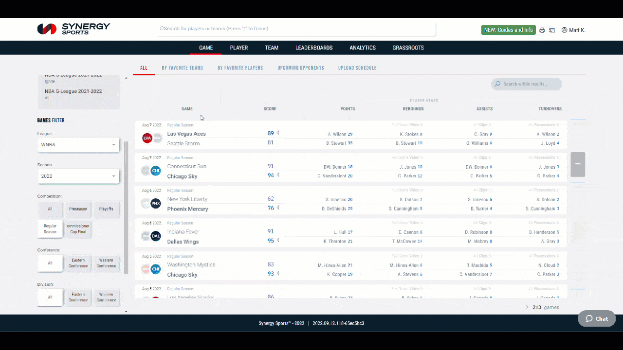
The most significant ground-level improvement included in the new site is in the addition of global search functionality. When Synergy began expanding at the college level, it is no secret that the team list got very long very quickly. The player whose last name appeared first alphabetically on the Atlanta Hawks roster has been the most viewed profile virtually every season since Synergy started, Conversely, teams hailing from extensive state systems or from schools with names starting late in the alphabet have done more than their fair share of scrolling over the years.
Now: The global search bar sticks to the top of every page on the new site and you only need to input a segment of an institutions’ or mascots’ name to get where you want to go.

Virginia was 1351th of 1483 teams in the teams in the college women drop down during the 2021-22 season.
The same functionality works for player names, so whether you know the name of the team a player is on or not – or the perfectly correct spelling of a name – is no longer a hurdle to reaching players’ pages.

Even if you forget how to spell Tshiebwe, Oscar gets the job done.
On top of the ability to circumvent the dropdown menus, the Player, Team, and Game pages now feature links to lists of upcoming opponents and favorites—lists of players or teams that you select and star, and you can manage those lists from the Settings menu. Global search opens the door to get across the database faster, but these new wrinkles cater to anyone logging in to get started on their next scouting report – jump starting it using your previous work.

Following rookie of the year candidates, potential roster additions, prospects, or likely postseason opponents is easier than ever.
If you frequently navigate between leagues, you can now build your own quick filters list on the Player, Team, Game, and Leaderboards pages by clicking on the discs that appear on the right of all recent filters on scroll over. Whether you’re adding a quick filter for your conference to get a more focused game list on demand, selecting grassroots circuits to save clicks in the summer, setting up a jump to a previous, or picking the EuroLeague and a domestic competition to cover multiple bases, all of these improvements make it easier to get from point A to point B.
Along the same lines, it is now easier to click between Players, Team, and Game pages once you’re on them. Clicking a player’s name in a game page box score opens their player page in the given season, and all player pages now have a link back to their team page.
Team pages also feature a game log graph that does not just give a snapshot of how the team has performed throughout the year, but lets you instantly open game pages or jump to full game video, using the menu that appears when you scroll over a game.

The game log graph makes it easy to open the full game video of any game of any team—even across a full NBA season.
New: More Data and More Customization

Todd Whitehead from our Analytics & Insights Team dove deep on how these interactive graphs can be used.
While the updated aesthetics, ease of use, and interconnectivity of the views you’velong been familiar with will pay immediate dividends, there are several new features packed into this release as well. Some are easy to find, like the clickable team total and game flow graphs on the game pages, but some are more subtle, like the ability to select made shots, highlight the paint, and watch all of a team’s makes in the upgraded single game shot chart.
The single game shot chart mercifully deprecates our last Silverlight dependency.
Need more flexibility in how you review or present your data? The core components of the views remain largely unchanged, but now you can customize nearly every table on the website using the small gear buttons above tables, and you can make results sortable as well.

This table is sorted on one of the growing list of statistics that can be added through the customization menu.
In some cases, the content and layout of views has changed to provide more discrete data sets. For example, layups, dunks, and tip ins had always been combined into the Around Basket category on the legacy Team Site, but are now broken out for teams and for players.
The site also offers a %Rank for %Time to illustrate how a player or team’s usage rates stack up across their respective leagues, just like we have always done with PPP.

Not only does this table show us how Trae Young’s efficiency stacks up with the rest of the NBA, but it also shows how highly ranked his usage in pick and roll and isolations was last season.
Other improvements get you to video more quickly whenever possible. For example, per game breakdowns on the Player and Team pages now have a game log, leaderboards run more quickly through the situation selector, game highs now populate across the more scrollable games list, and statistics from each player’s last 5 games appear on the player selection page.
The most substantial feature addition, however, is the Comparison page, which combines and modernizes several views from the legacy site for increased versatility, improving on former Digital DNA functionality. The comparison page provides a menu to easily select players and teams across seasons and leagues, a toggle to jump back and forth between statistics and playtype data, and both a graph and table display of the data.

The new comparison tool has a versatility the Digital DNA views lacked.
For all that’s new in 2022, the most-used features of the previous Team Site are exactly where they always were but much easier to get to. Specifically, Editor or in-browser video options now appear when opening video, full game video is still available from the Games list, and the overall and playtype views on the team and player pages still have the same rows and feel – even if you now click between them and expand individual actions when you want to dig deep instead of having to scroll through 6 pages of tables.
We hope you’re as excited as we are to use the new Synergy Team Site, especially the improved navigation, comparison, search and customization options that are now in your hands. We look forward to bringing you even more updates in the coming season.
If you’d like to see one specific example of the type of value the new Team Site will bring, read this article looking at how to assess team comebacks.